FinTech, Financial Services, Banking, B2B
Oct 2021
This case study highlights the redesign of the Account Summary feature within Truist’s Commercial Banking platform to better serve business clients managing complex financial portfolios. As Principal Product Designer, I led the effort to simplify information architecture, surface key insights faster, and streamline workflows for greater efficiency. Through close collaboration with stakeholders and external partners, we reimagined the account overview to support faster decision-making, reduce onboarding friction, and improve client retention. The redesigned experience resulted in a 25% reduction in onboarding time, a 30% improvement in task completion rates, and a 20% increase in client satisfaction, ultimately delivering a more intuitive and actionable financial dashboard for Truist’s commercial users.

Simplified commercial account data through strategic, research-backed design leadership
As the Principal Product Designer on this project, I led the end-to-end UX strategy for the redesign of the Commercial Account Summary feature. I partnered closely with product managers, engineers, and external stakeholders to align user needs with business goals, translating complex financial workflows into a clear, intuitive interface. I facilitated cross-functional workshops, created high-fidelity prototypes, and conducted user research with commercial clients to validate design decisions. I also mentored junior designers on the team and ensured that our design system remained consistent and scalable across the platform.
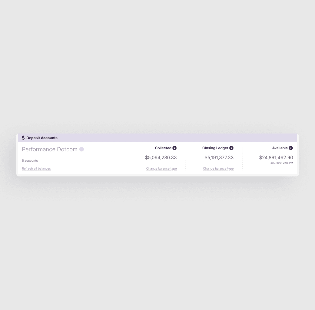
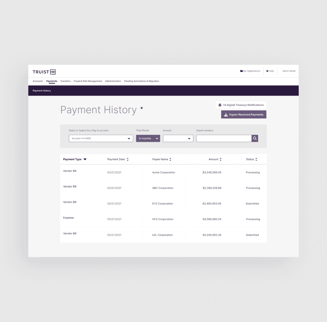
Transformed Truist’s commercial banking interface to enhance usability and reduce support reliance
To address the complexity of Truist’s Commercial Banking Account Summary, we designed a streamlined, intuitive interface that prioritized clarity, flexibility, and usability for business clients. The new solution reorganized financial data into digestible, actionable sections, surfacing the most relevant information at a glance while allowing deeper exploration when needed. We introduced smart grouping, visual indicators for account health, and customizable views tailored to user roles. Integrated support tools and contextual guidance reduced cognitive load and improved navigation. This solution empowered users to manage multi-account portfolios more efficiently, make faster decisions, and reduce their reliance on support teams.
Improved task efficiency, onboarding speed, and client satisfaction while reducing support needs
30% increase in task completion rates, improving the efficiency of accessing and interpreting account data.
25% reduction in onboarding time for new commercial clients, streamlining the user experience.
20% rise in client satisfaction with the account summary feature, as indicated by post-launch surveys.
15% decrease in support requests related to account navigation and data interpretation.